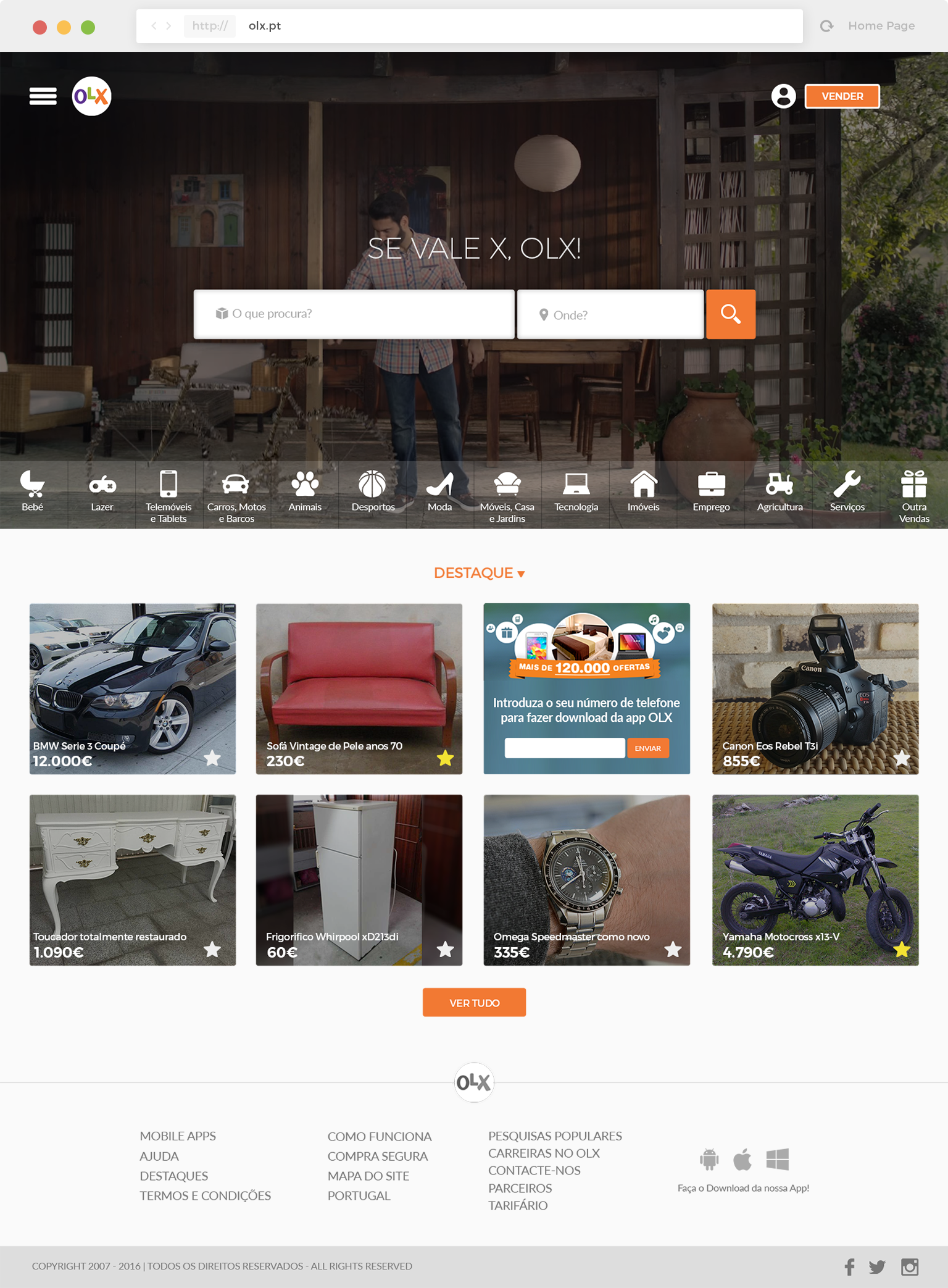
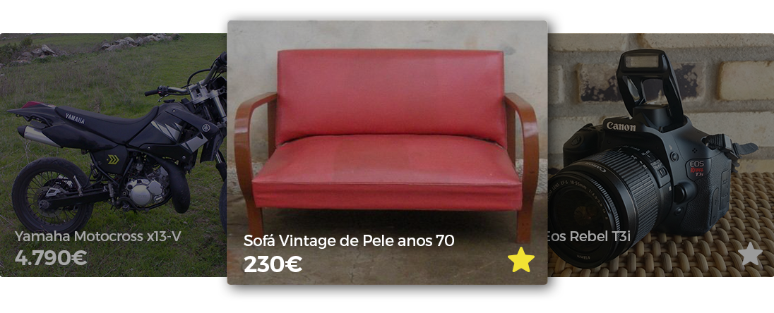
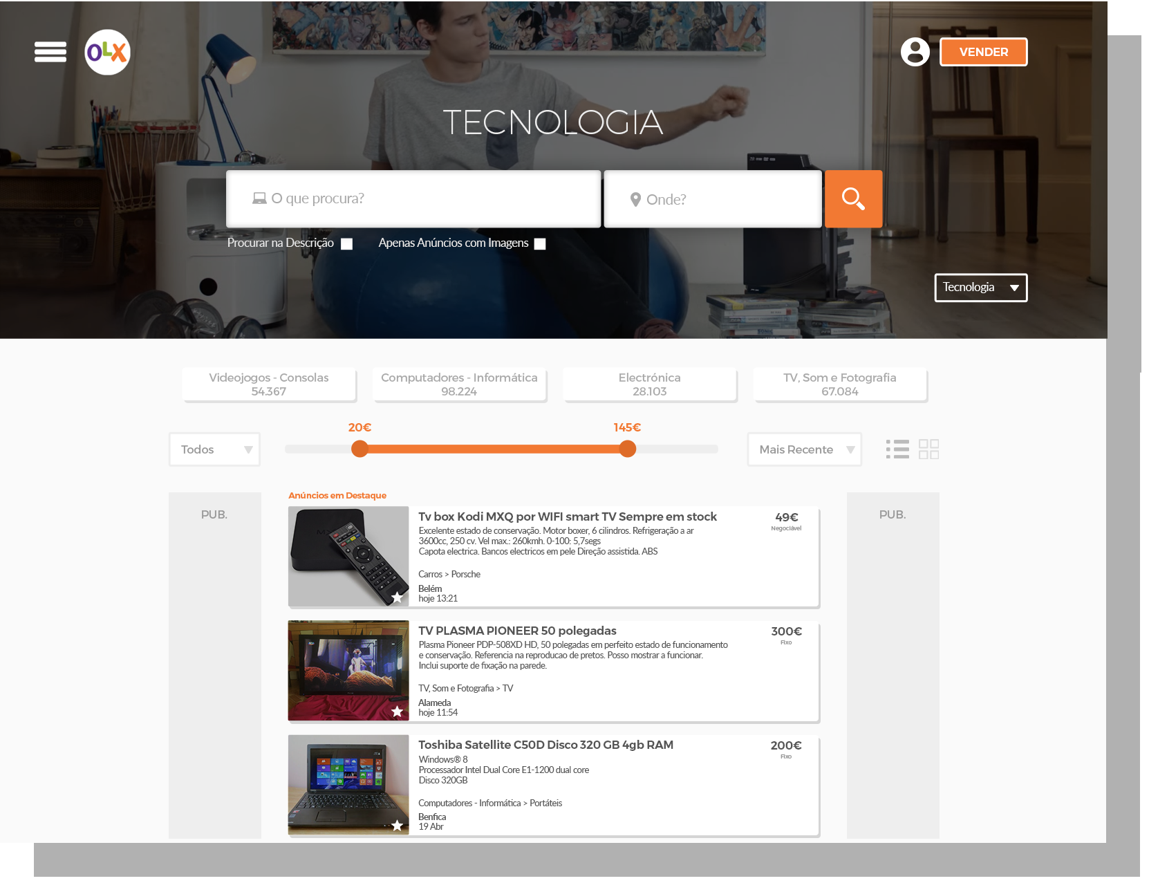
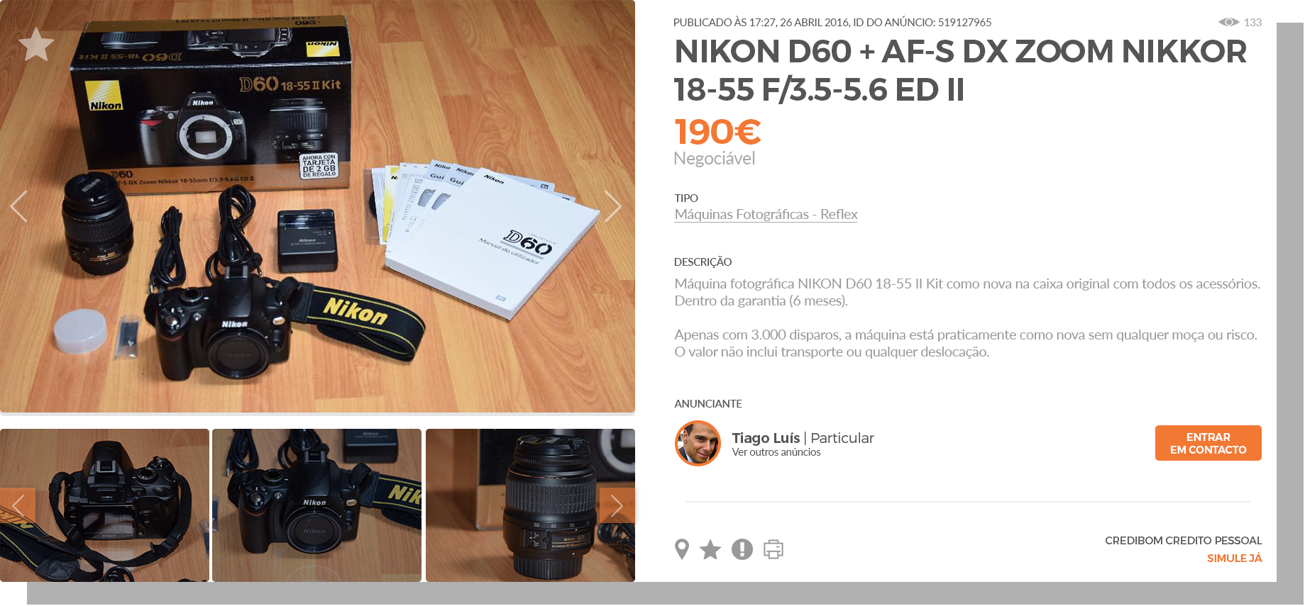
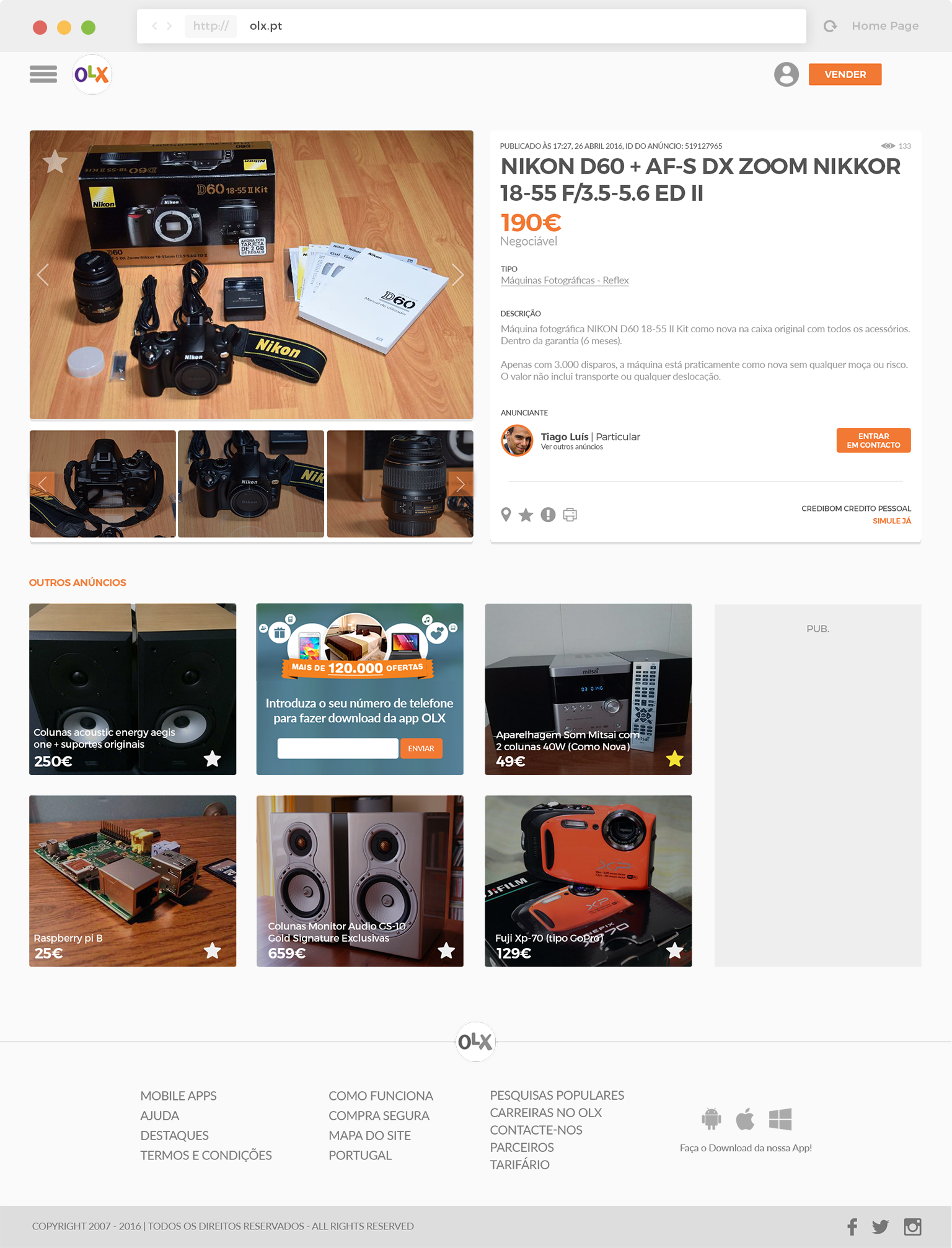
INTRODUCTION

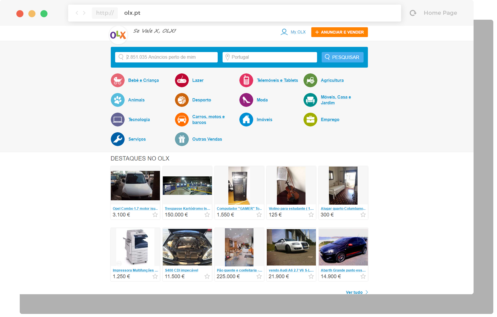
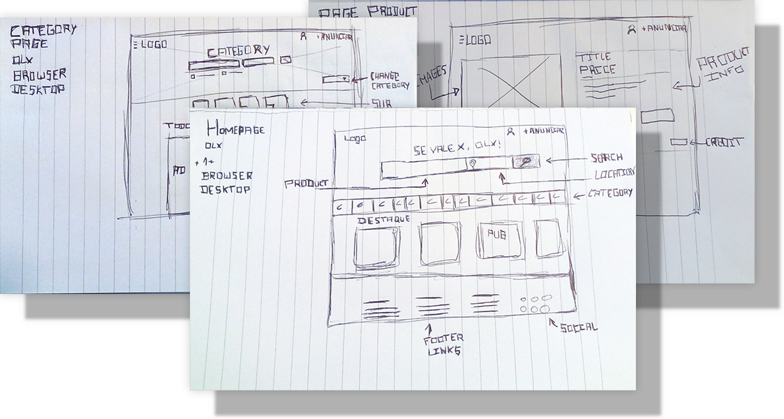
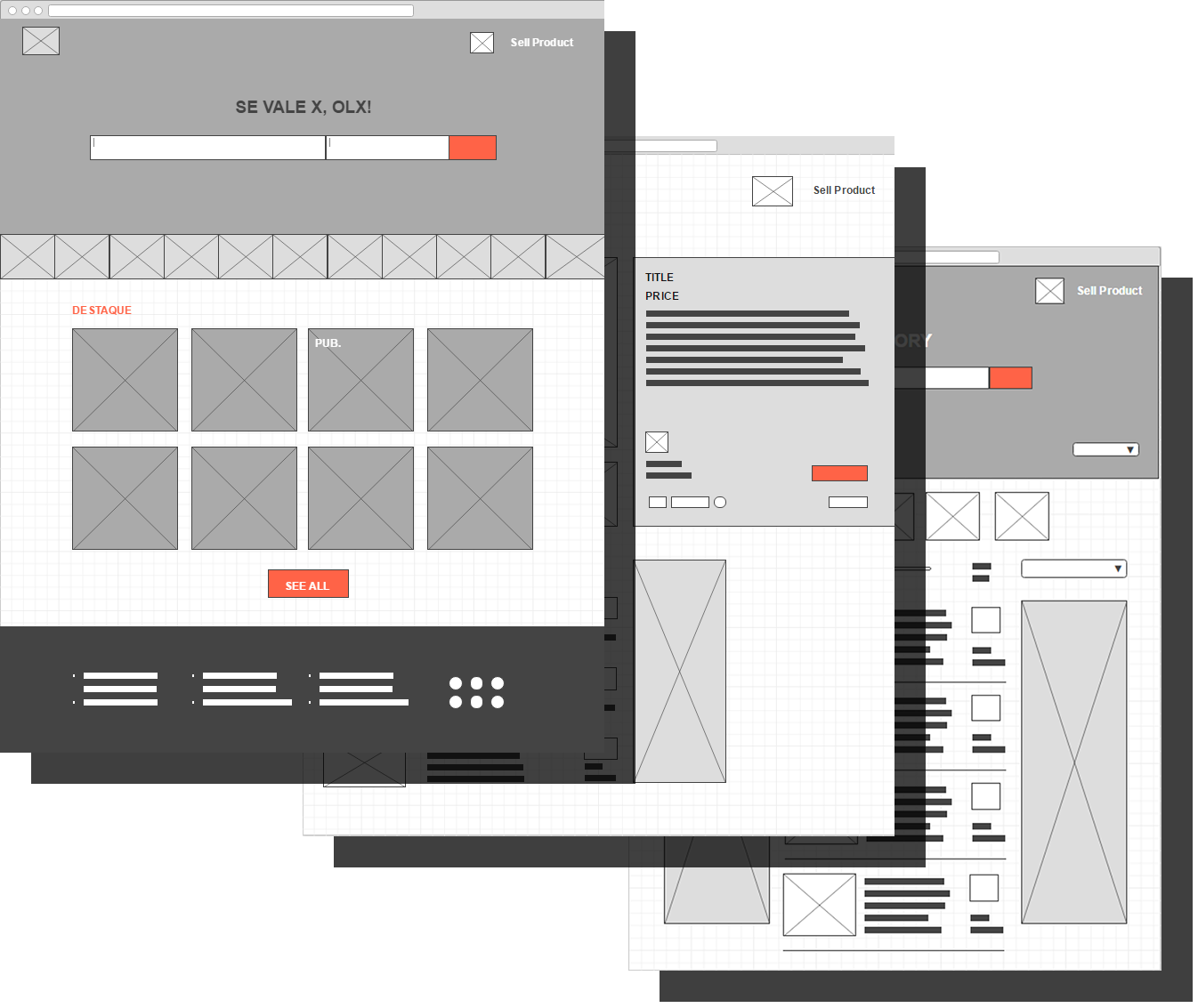
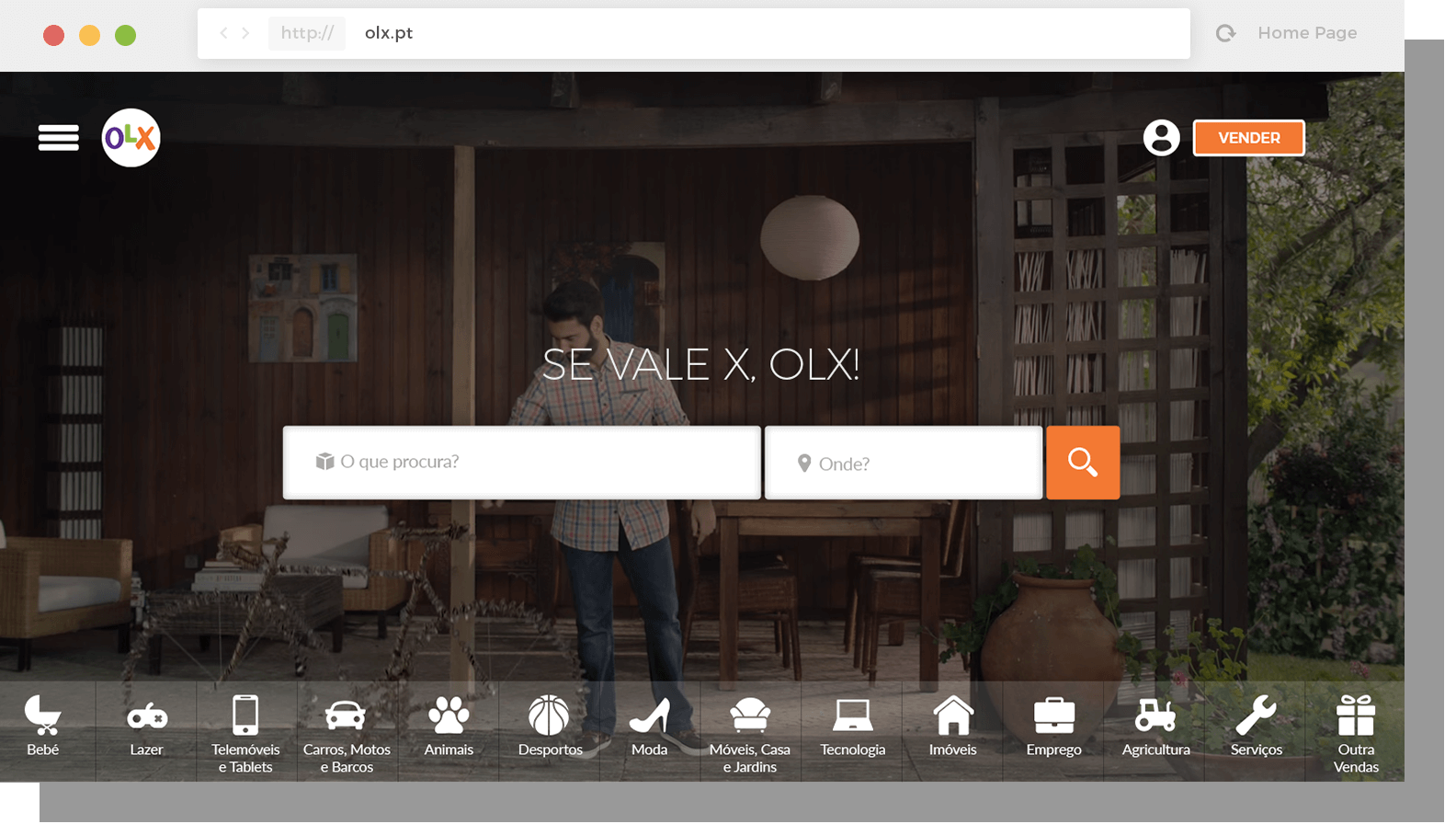
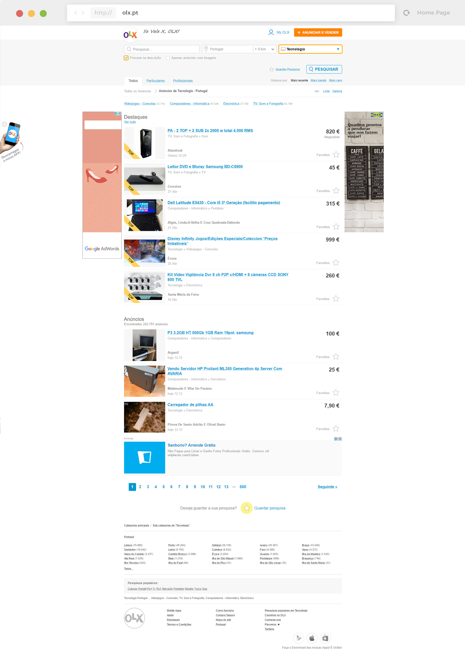
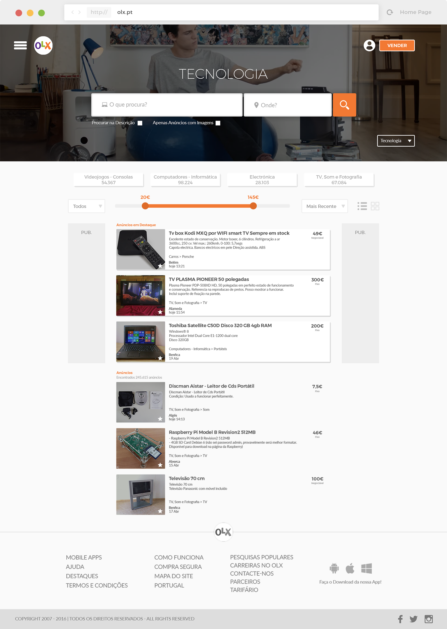
OLX is one of the most visited websites in Portugal. People use OLX as a showcase to buy and sell used products. I’ve used the olx several times and recommended but it’s time for someone to improve the outdated look. Here is my proposal…

#FirstThingsFirst

Current Website

The current website does not lack in functionality. However, it’s time to improve the interface to not fall behind. The target of olx is very broad, from 8 to 80 there are several types of people visiting the website. So I had the worry of trying to meet all these targets in order to not provoke any kind of strangeness in users.

#HandsDirty

Sketch

I had to define the framework of my redesign. I have created many different layouts to determine the best ways for the users to appreciate the content.

#PageSchemati

Wireframes

After several sketches, it was time to create the final wireframes. I chose only redraw three pages, which I think are the most important pages of the website:

  • Homepage
  • Category Page
  • Product Page

#TimeToMakeGreatChoices

Fonts & Colors

It was time to begin the redesign by choosing the fonts and the colors. I have to confess… It’s my favorite part of web design process. For the fonts, I choose to combine between Montserrat and Lato.

#333333

#f27933

#montserrat
A B C D E F G H I J K L M
N O P Q R S T U V W X Y Z
1 2 3 4 5 6 7 8 9
#lato
A B C D E F G H I J K L M
N O P Q R S T U V W X Y Z
1 2 3 4 5 6 7 8 9

#HomePage

Perfect To Create Impact

Spot The Difference

Before Tiago

Relatively functional page but very unattractive

With Tiago

It has all that has the current page but in a much more attractive way

#Ui&Elements

Better Experience

All the elements had been precisely redesigned to give a better experience to the users.

#CategoryPage

Improve Targeted Search

Spot The Difference

Before Tiago

Functional but very unattractive

With Tiago

The same features but so more attractive

#Ui&Elements

Better Experience

All the elements had been precisely redesigned to give a better experience to the users.

#ProductPage

The most radical change

Spot The Difference

Before Tiago

Page with many features but the information is very dispersed eventually get a little confusing.

With Tiago

Exactly the same information but with greater focus on what really matters to user.

#Final Result

Hope You Enjoyed
#Homepage
#CategoryPage
#ProductPage